
Making the Right Font Choice For Your Book Cover
- May 31, 2023
- 3 min read
Fonts play a critical role in design as they can significantly impact the visual appeal and readability of a design. The right font choice can help to convey the intended message, tone, and personality of a design. By selecting the appropriate typeface, designers can establish a consistent brand identity, improve legibility, and enhance the user experience. Additionally, fonts can evoke specific emotions or convey a sense of urgency or playfulness, depending on the project's objectives. A well-considered font choice can make all the difference in creating a design that effectively communicates its intended message and engages its audience.

Choosing the right font for your book cover is an important step in creating a visually appealing and effective design. Here are some tips to help you make the right font choice for your book cover.
Consider your genre
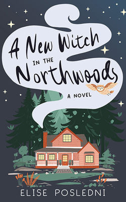
Different genres often have different font styles associated with them. For example, serif fonts are commonly used in traditional literature, while sans-serif fonts are often used in modern or minimalist designs. Consider the genre of your book and choose a font that matches its tone and style. A romance cover is more likely to have a script or handwritten style font. Whereas thrillers tend to have a bold all-caps font style.
Keep your font choice legible
The most important aspect of your font choice is that it's easy to read. Avoid overly decorative or complicated fonts that may be difficult to read, especially in small sizes or on digital devices. It's easy to forget to consider that many people shop for their books online where the cover will be displayed as a small thumbnail.
The colors of your font are also important and can impact its legibility. Keep the font colors high contrast and the background less busy to improve readability.
Pair fonts carefully
Consider using a combination of fonts to create visual interest and hierarchy, but be careful not to choose fonts that clash or are too similar. Use fonts that complement each other in terms of style, weight, and spacing.
Avoid well-known fonts
If a lot of people can name the font, then it probably is best to avoid. Fonts like Comic Sans, Times New Roman, or Papyrus are easily identifiable and that can be distracting. Also, chances are if people who aren't working in design can name the font, then it's probably because people tend to make fun of those fonts. This sketch from SNL also comes to mind.
If Ryan Gosling is going to obsess over your book cover design, make sure it's not because you chose a bad font.
Test it out
Try out your chosen font(s) in a mockup of your book cover to see how it looks in context. Consider how it will look in different formats, such as in print or on an e-reader screen. Sometimes it's easier to pick a font when you can see how it works with the whole design. A font could look great in a preview and then not be the right fit once you've put it with the design.
Consider licensing
Ensure that the font you choose is properly licensed for use on book covers. Avoid using free or unlicensed fonts, as they may not be legally available for commercial use. If they aren't listed as public domain then chances are they aren't really free to use.
Overall, the font you choose for your book cover should be appropriate for your genre, easy to read, and visually appealing. Take your time in choosing the right font(s), as it can have a significant impact on the overall success of your book cover design.


Comments